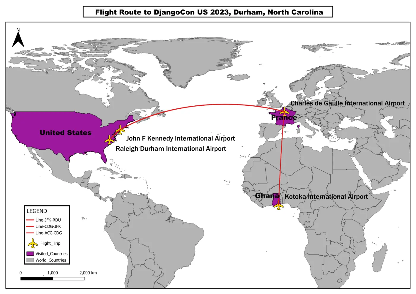
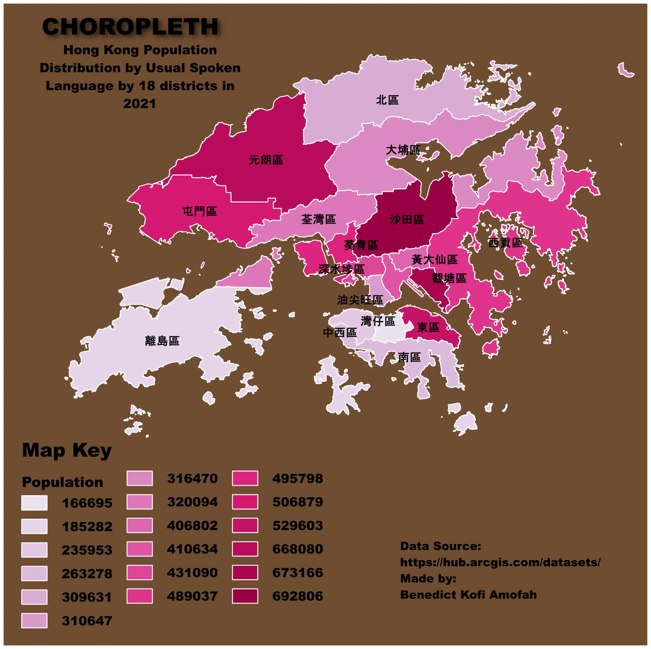
DAY 01
Town Distribution Across Ghana
Points
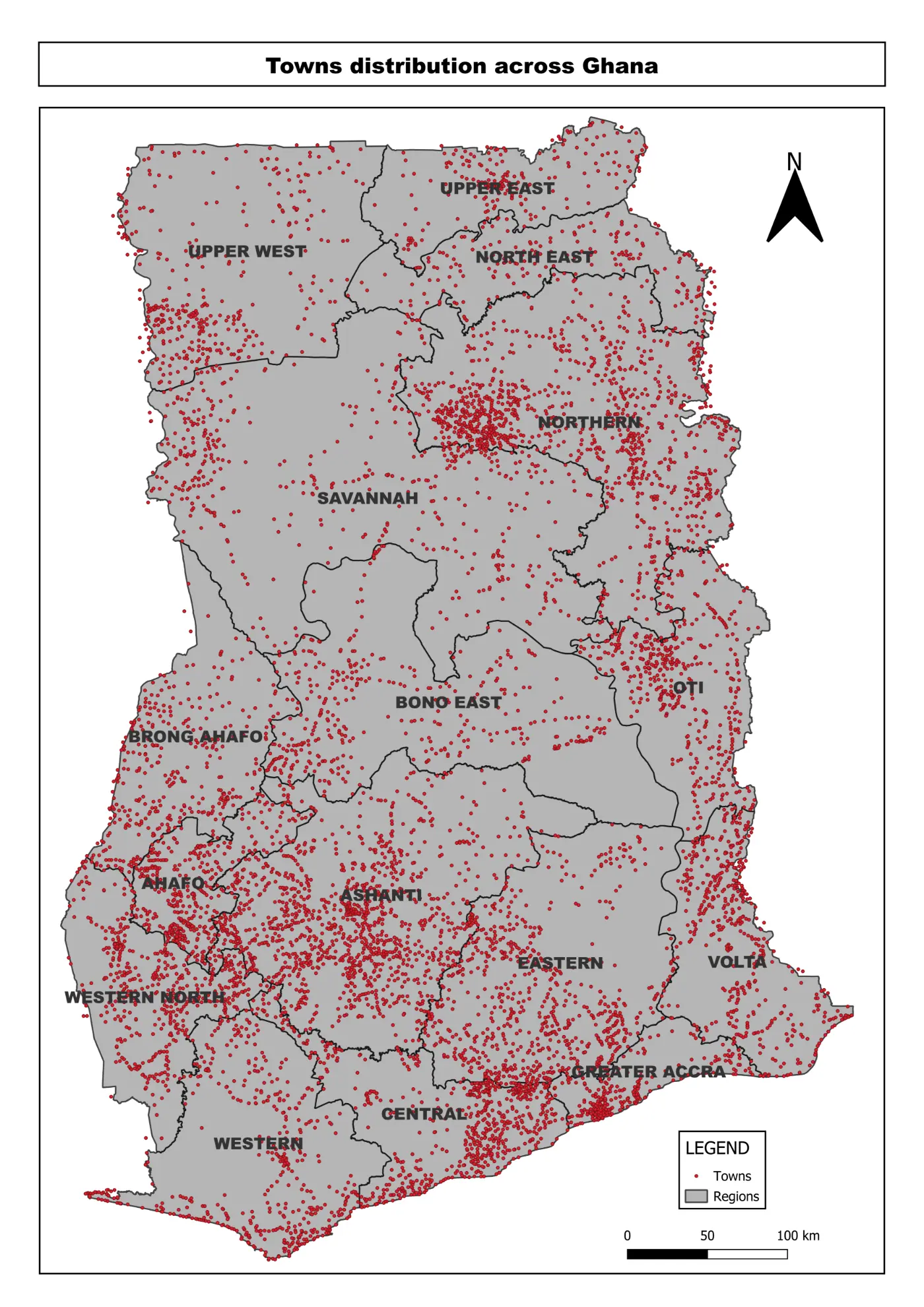
Points
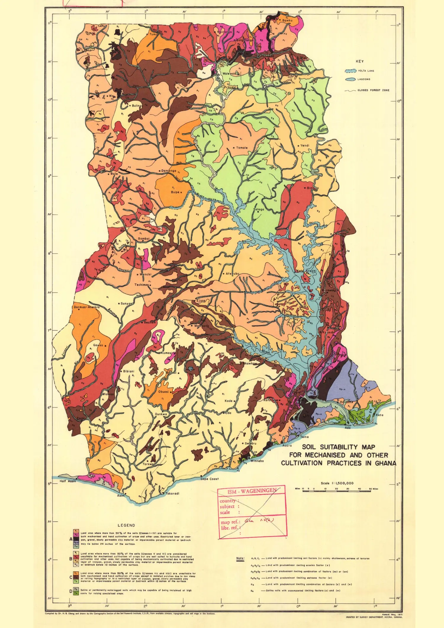
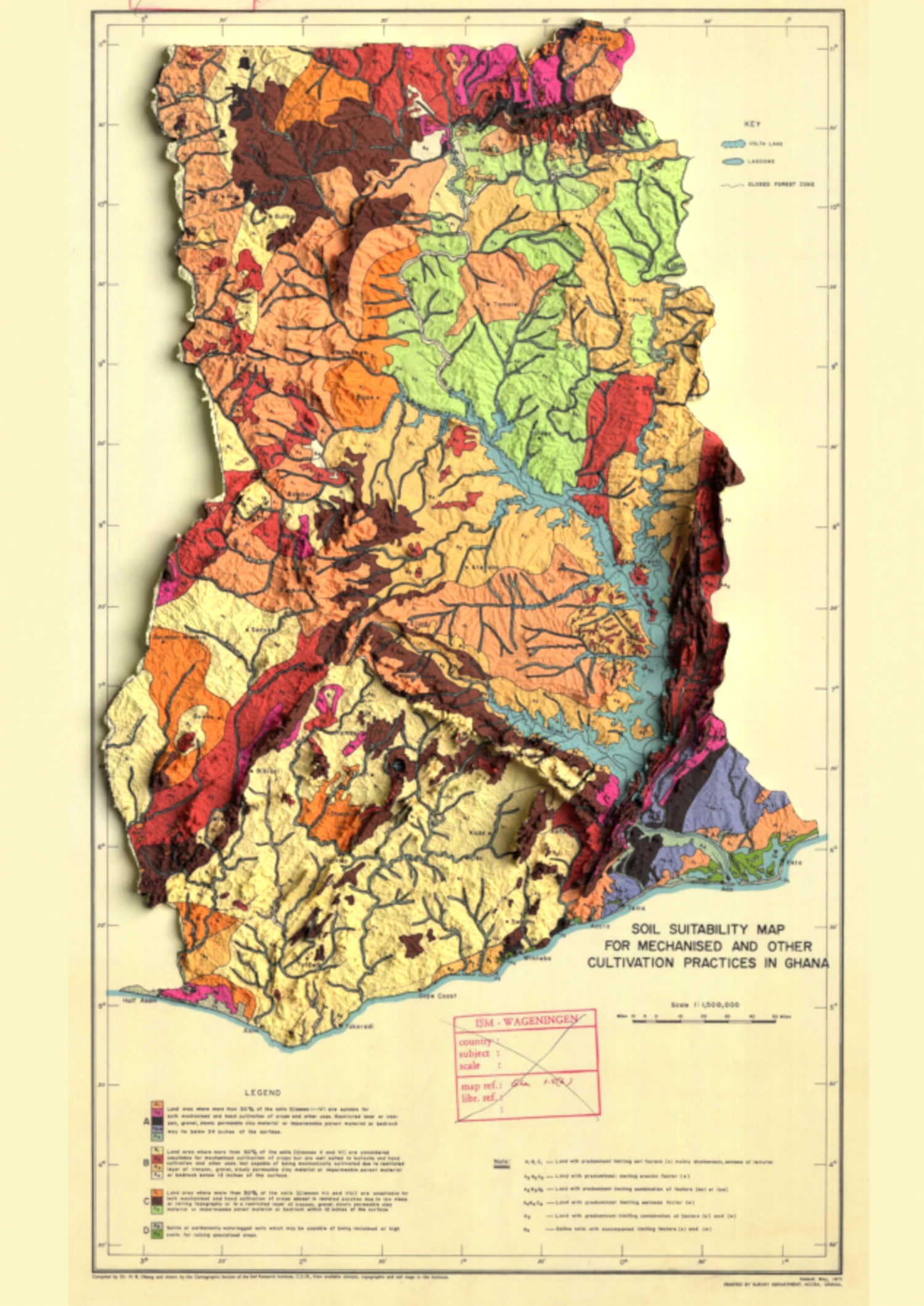
This map visualizes the distribution of towns across Ghana's 16 administrative regions. Ghana is divided into 228 districts, categorized as ordinary, municipal, or metropolitan based on population thresholds.